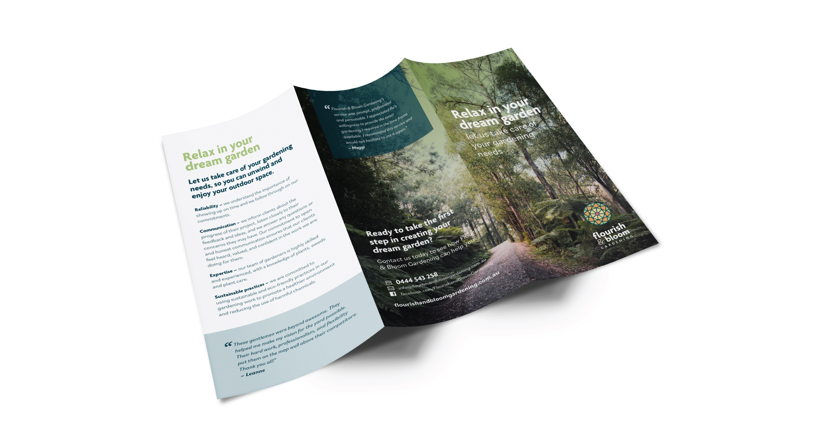
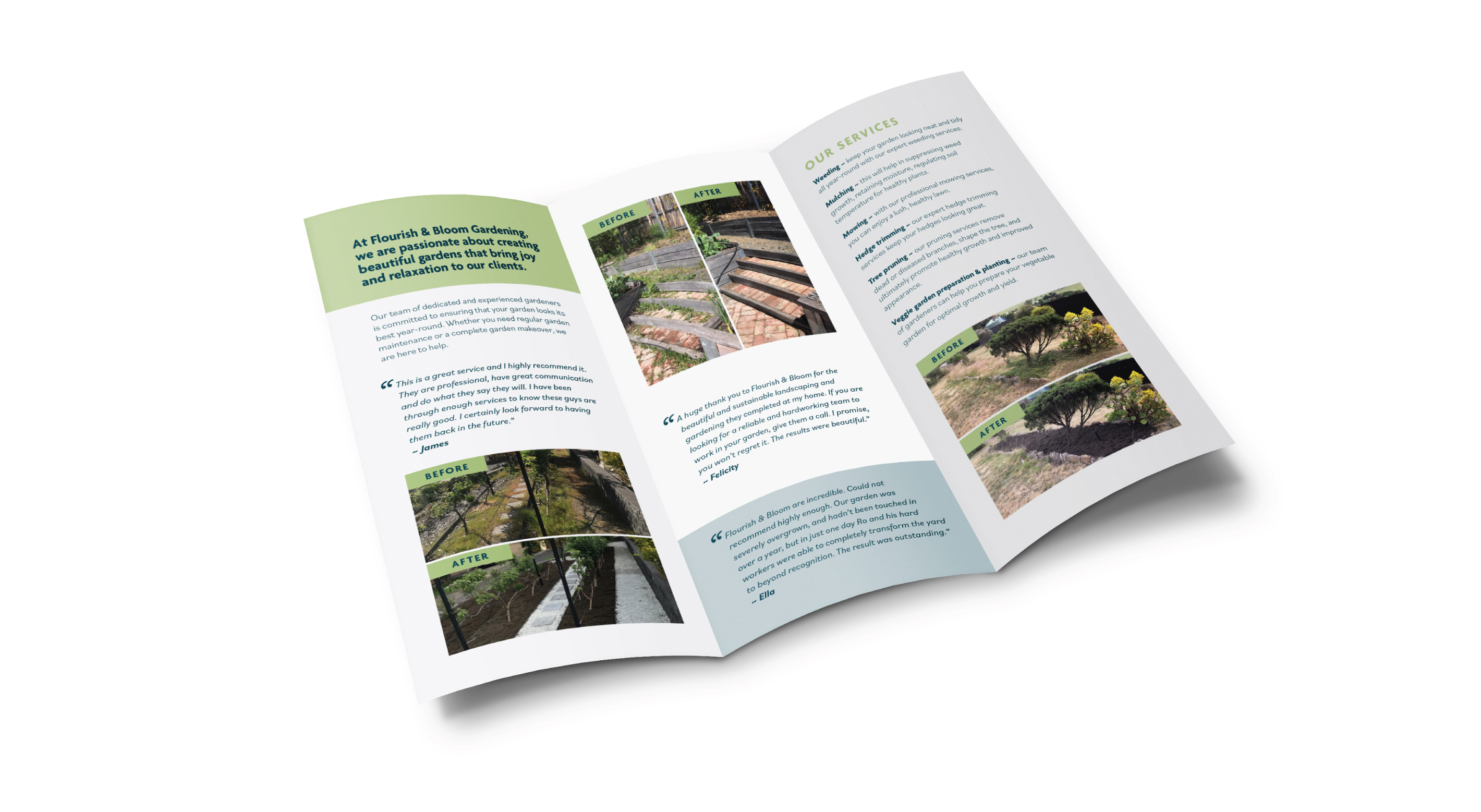
Subtle change, big impact
The client came to us wanting to utilise his existing graphic, but modernise the overall look and feel of his logo. A subtle softening of the colour palette along with considered type has brought new life into Flourish & Bloom’s visual identity.
See our other projects


